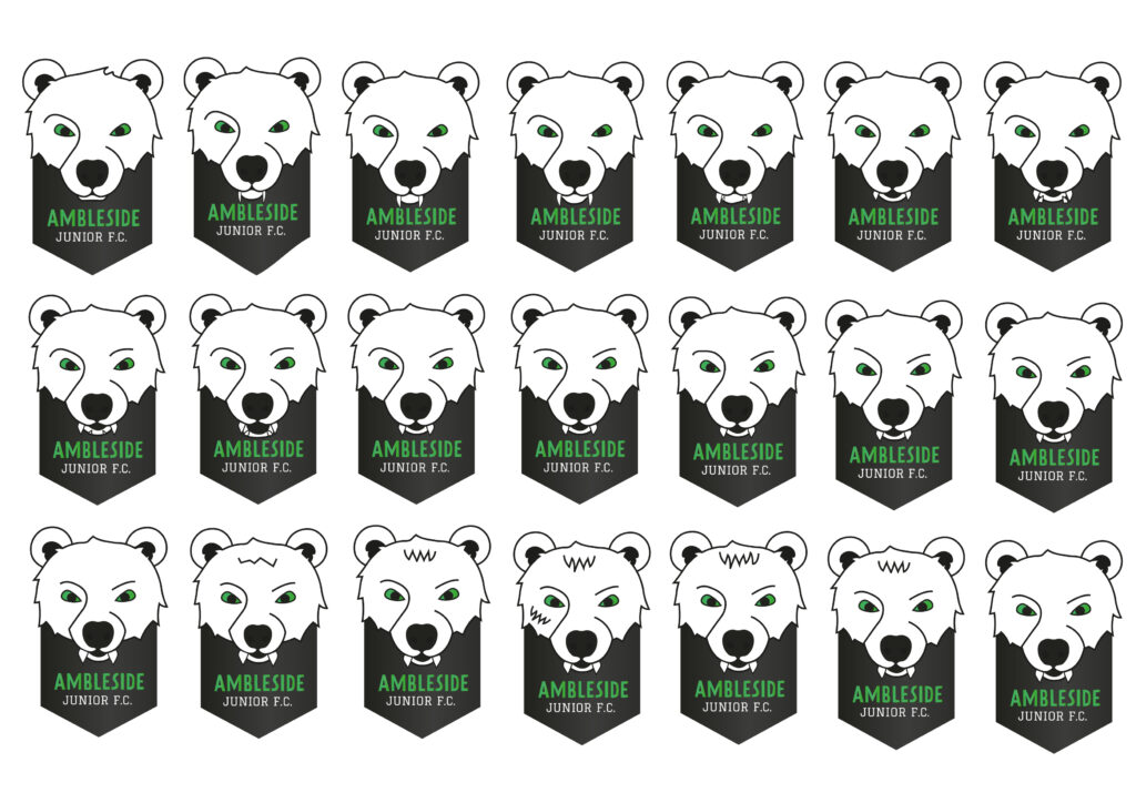
During our second week we mainly focused on developing and finishing up the logo and also starting with other designs.
I tried to apply a bit different approach on the bear ball, but I didn’t liked them as much. Later I have also been given feedback that if it’s zoomed out it might look like panda, but not a bear. During part of this development where we also been told add some emotion on the bear to make it more appropriate to our target audience.
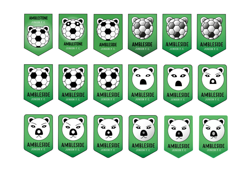
Here I also tried to play around with Zofia’s logo as it seemed that client has liked these the most so far, but some of the layers where done quite weird there so adjusting some of the things was quite tricky. And it appeared that most of the details I tried to add disappeared when zoomed out. We decided to go with fresh Zofia’s logo idea and which tutors seem to like it. There was quite a few elements that we could use throughout the whole campaign.
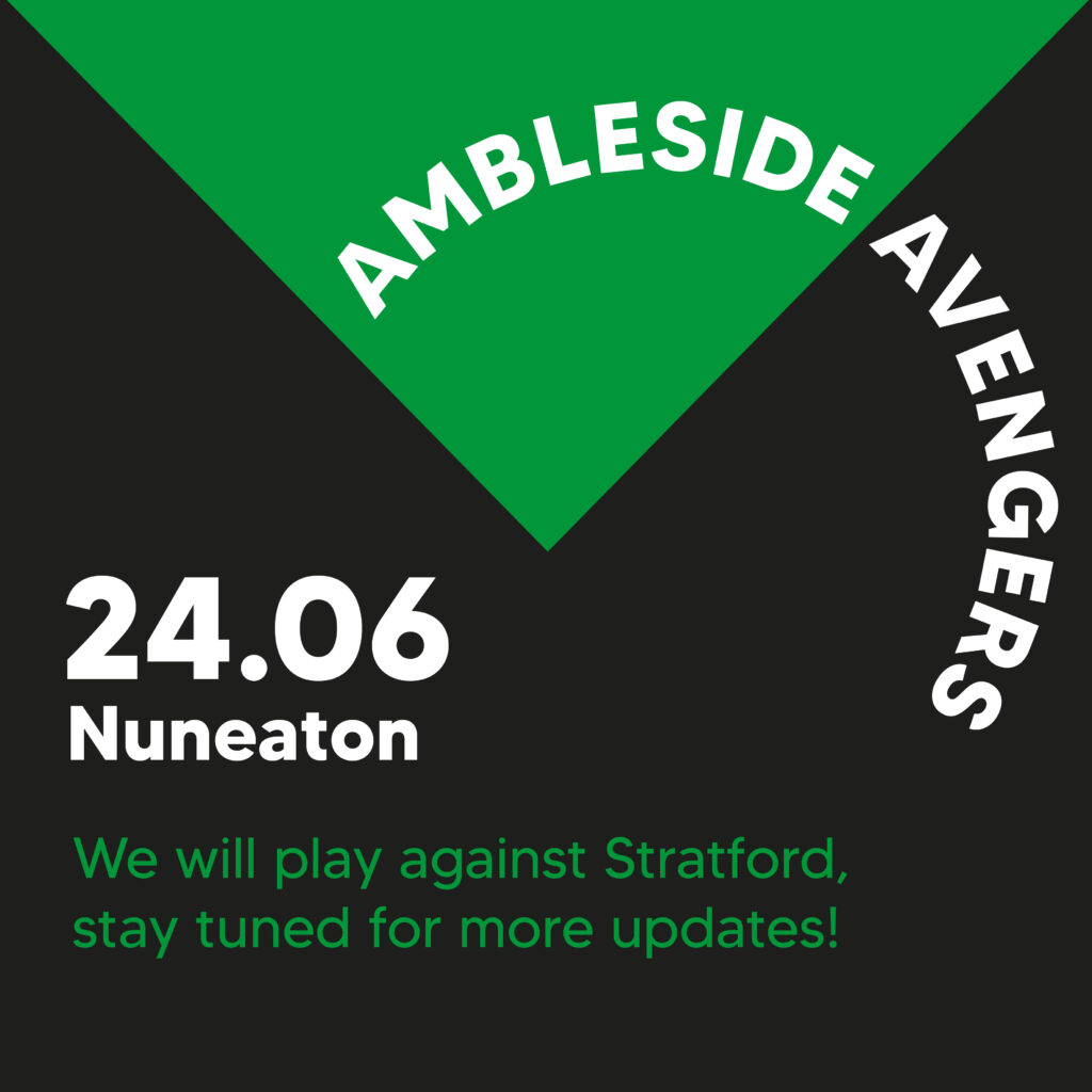
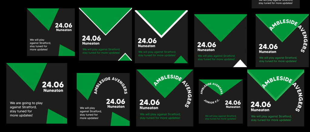
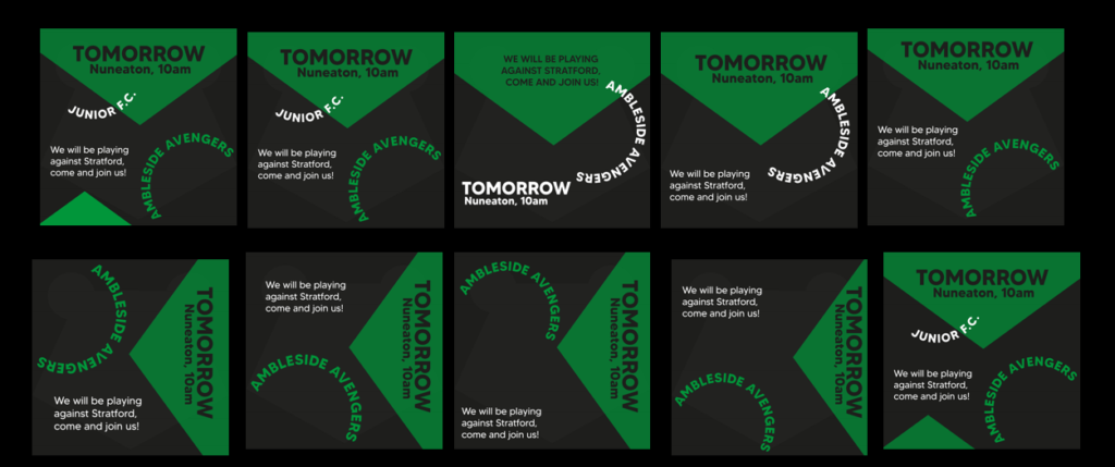
At this point I volunteered to do social media posts since I prefer screen design in general, so it was a perfect pick for me. I started researching social media posts for football. It usually features players, game highlights, announcements and stats of the game or players. The graphics are maintained simple and usually the typeface is quite big that is used for titles, since the post itself is seen on the phone, so it can be only way for it to be visible. There is a lot of playing around with different shapes and elements and layering them too. It rarely has a logo, but it depends on the team.
From this point forward I was mostly thinking of which graphics I would use for instance like event announcements etc and have been mainly trying to play around with placement of objects. I feel like since we wanted to use what we had from logo it was a bit restricting at some moments, but I have used some of my composition skills that I have developed throughout photography and just played a few times around with it. I know it’s rarely turns out perfect the first try, so it’s really the case of just trying things out. During the meeting with tutors they said that they like the use of circled text as in the logo and encouraged to play more with it in the overall brand.
There was also player of the week social media post that I had to prepare where I was editing the picture to a more white balance since most of them were really yellow and it would be clashing with the colours we are having. Here Zofia helped me a bit with that with adjusting placement of some of the elements.
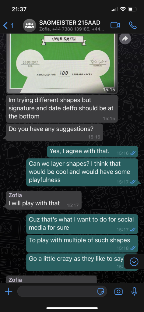
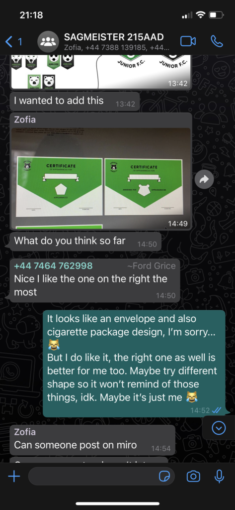
In general for most part I was working closely with Zofia and providing feedback to her work as well like certificates and even trying to decide on the right shades of gold, silver and bronze during the zoom meetings. I enjoyed this part of the process since it made me feel like working in an industry already with the way we helped each other. Despite that some of my ideas were discarded, it was still a positive experience.