This week we have been finalising designs and preparing our presentation for a client.
I wanted to make a post where it would say which teams would be playing, but I decided later when I tried that it would clash with the rest of the visuals and would take away from the brand consistency.
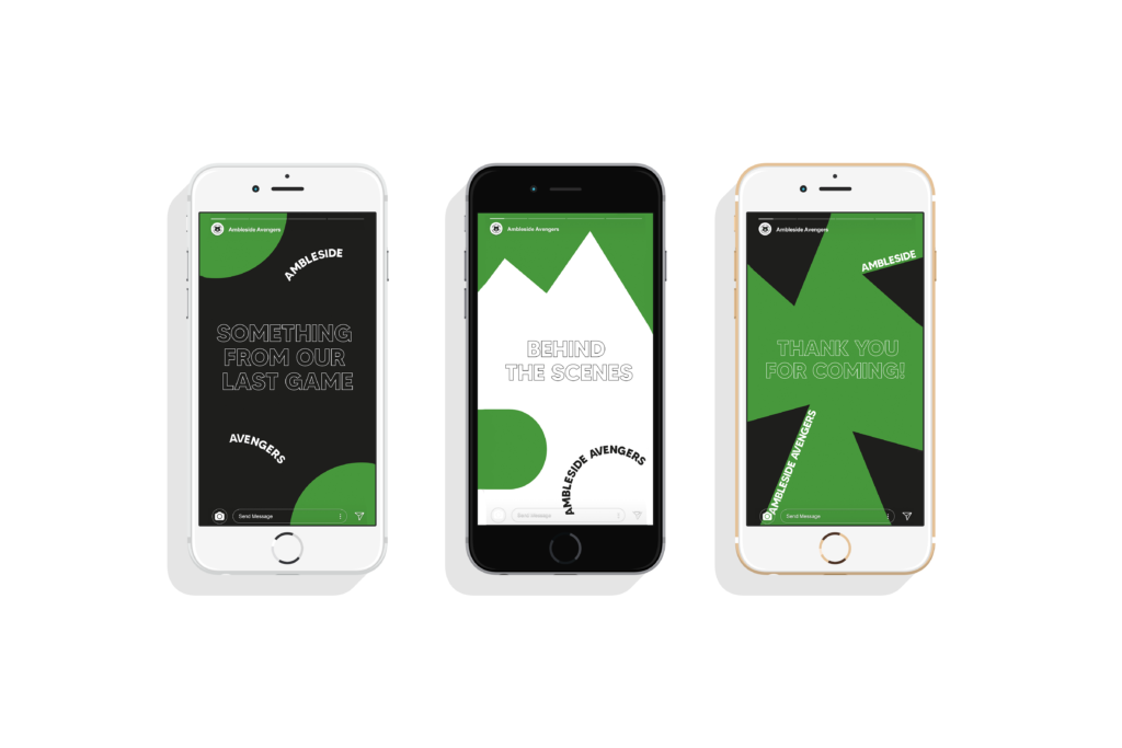
Since I was taking social media quite seriously, I wanted to ensure that everything is developed fully when it comes to it including stories. While me and Zofia still expected for our other team members to participate, I thought that we still have quite some time on this project as we counted on our other team members to at least produce something. Despite this I still kept sharing my ideas for social media stories with team members that has actually been working. I wanted for JFC to have consistent story graphics and since it won’t be on every story, I thought it would be good idea to have like an intro graphic for different things like behind the scenes and such. Another one I wanted to do was similar idea, but for photos for the last game. I already noticed though that it’s quite complex to incorporate brand style on stories without being too much and still use negative space to make it as clean. The last one for social media I thought it would be nice to include graphics that would thank everyone for coming to the game. Since we have a match recap post, I decided this is a perfect one for stories.
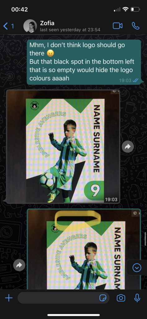
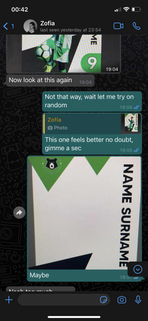
I always tried to work with team despite how many members there actually was working and been given some feedback that didn’t really work in some cases, but it’s a part of development and working together as a team. There was also a post that Zofia suggested that I also thought would be a good idea to use of the end of season too. I wanted to see how it would work with other colours, but it seemed the green worked the best.
The last bit that I’ve done on those posts was to make fix the kerning and leading, since I didn’t see a purpose on doing it much when it’s still in developing stages. I also wanted to point out that in I didn’t wanted to move titles on stories on the sides, since the device size varies and sometimes it can cut off the sides, so I had to design it keeping that in mind. This has come to my attention when I got my new phone myself since it just doesn’t show sides one stories if it’s aligned too much left or right.
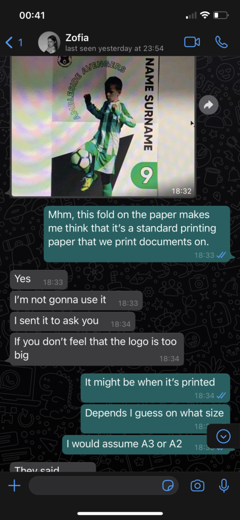
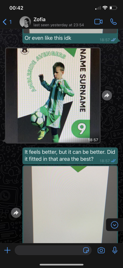
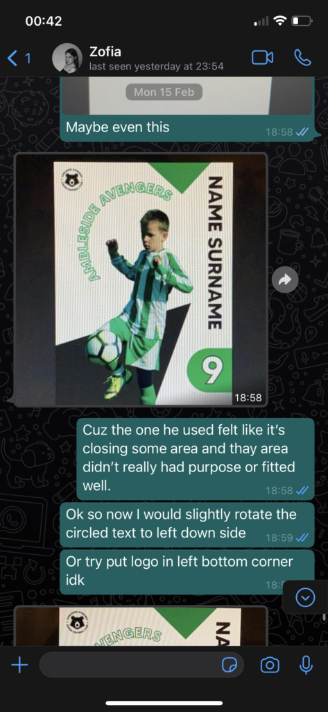
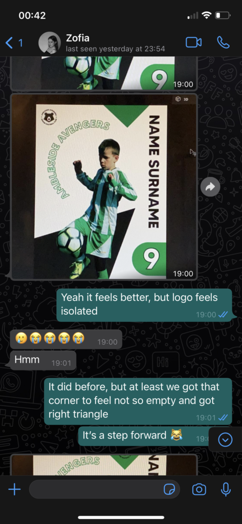
Ford was struggling with his posters and I have gave him feedback, but some of the things weren’t considered so we had to later do some adjustments with Zofia. We both were working on this and I have tried to mimic the poster as well to show where things could go when providing possible solution to our problem.
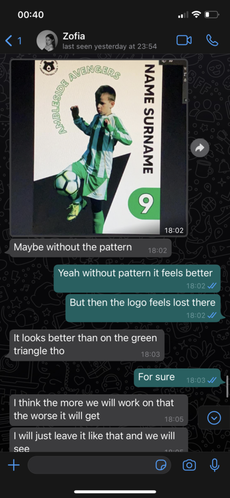
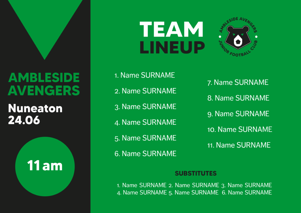
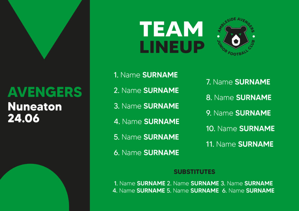
Ines was meant to do team line-up, since she joined later and still wanted to do something I thought I can give this part to her, but apparently she disappeared again and I had to do it pretty much last minute. It wasn’t the most pleasant experience, but I’ve managed to research some things for it too. I have found out that there is always 11 players and 6 substitutes. When it comes to designs I analysed from my research it all seemed to have a playfulness with typeface sizing and weight which was highlighting the most key information such as surnames for instance. I wanted to create such hierarchy of content as well. It also seemed to be quite simple graphics. Most of these also seemed to have some pictures of the players, but it didn’t feel to be needed since it would overcrowd it too much especially if used for as an Instagram post.
When developing team line-up there was a lot of things that I have tried with text and I also tried to play around with shapes, but some of them seemed to take away from info as it made it illegible. I also wanted to make sure that gaps between each player are not too far way especially since it was making the team lineup feel heavier on text that way. Making some adjustments on that helped me fix this problem. Zofia helped me with final version as she made small adjustments, but I preferred my final option instead when it comes to the names of the players. It just seemed more appropriate hierarchy wise, but these are one of the things that I couldn’t do much about since it was only me and her working for most part.