I decided to write about the process of how I have created and what steps I took to create my typographic poster for “Design Practise” module. The concept behind this is meant to be destruction, which is basically destruction of nature because of industry.
While I was creating my typographic poster I have been struggling a lot, so for me trying to find a way to explain the concept just with the type was a really hard task. The things I knew before was that the typeface has to be bold and big, it has to make a statement. At first I wanted to use different text, like “Destruction awaits” but instead I have decided to use the tittle of the story, not only because it’s not that popular, but also because it’s the thing that would relate it to the destruction of nature. While the typeface is destructive, there’s no need for it use word “destruction” anymore. Basically I have went through a lot of process and I have made quite a lot of posters to actually come up with the end result. So here’s more about the process.
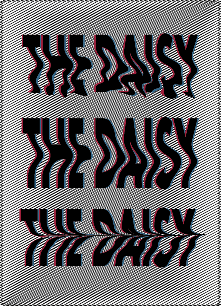
At first I have went for something distorted, I have been playing around with colours to create a glitch effect. I have used scribble tool on Illustrator for my background and have played around with some options. Personally, I liked how this one turned out, mostly because I like glitchy things. I have thought this could be associated more with radiation maybe, but not actual destruction so as a result to this I had to throw this idea away.
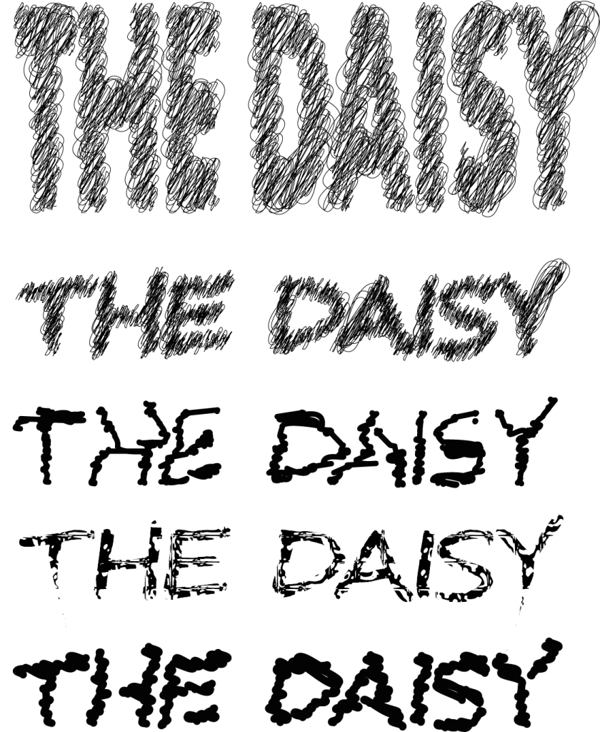
The second poster I came up with was the one where I have been trying a lot of different sketchy typeface effects. At first this was more of an test page rather than a poster, but later I decided that it could also work as a poster. Unfortunately, I came up with conclusion that it’s not communicating concept of destruction well enough.
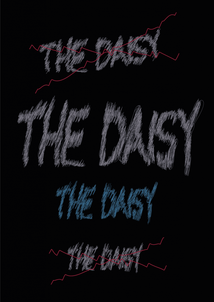
After the previous try I have decided to look into punk subculture and look for inspiration there when it comes to concept of destruction. The main reason to this is because the previous style of the typeface kinda reminded me of it. I have decided to use more colours, to use some lines to cross some text out, but I wanted to keep the vibe of punk. It turned out really nicely and I liked how it looks, I had researched colours and toned them down, but I felt like it doesn’t communicate destruction that well. It’s close to it, it’s rebellious, unless rebellious type it’s destruction itself.
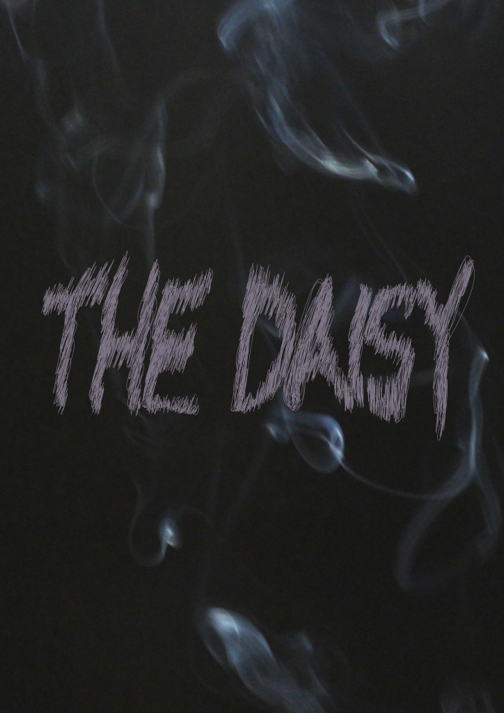
Moving on I have remembered that industry and factories are mostly having a biggest effect to nature because of pollution. As a result to this I have thought that I could use some smoke in my poster, but I felt like the type won’t do it, because it won’t appear destructive. This was the main where I have decided to use another medium, which in my case was photography. I have lit up some incense sticks, took a black piece of paper and took some pictures. Later on I have simulated the colours in Lightroom and after that I have finished it up with Photoshop. I couldn’t make it too dark though, because then the more wouldn’t be so visible. But then again after all this hustle and tries, I have realised that it doesn’t communicate concept of destruction and even if it does it slightly, it’s unclear what this smoke is for.
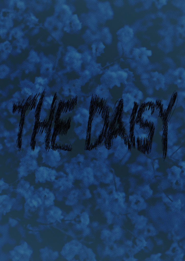
Then I’ve thought maybe it would explain more if I was to use actual nature fragments in my poster. I had this bouquet of dried gypsophila’s at my home and I decided to take a picture of it. Once again I have simulated it with Lightroom and adjusted some other things with Photoshop. My typeface was the one I have made on Illustrator. When I think of it, it already sounds complicated. Anyway, I came up with a few versions, but I have felt that the image takes too much place and if I make that picture into typeface, it’s not destruction anymore.
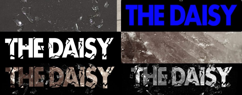
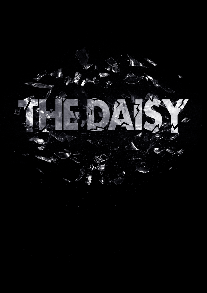
Finally, this one is my favourite, not because I like it, but because I felt that it’s right for my concept and maybe because some destruction actually happened during the process. At first I took a glass jar, I’ve placed it in a bag and I’ve smashed it. Basically because I wanted to make a shattered / broken glass effect. At first I have worked with my typeface itself, I have picked Futura family, because I thought it does make a statement, it’s easy to read and it still will be readable after I will finish with my work. Secondly, I had to make sure that the kerning is correct, then the fun began. I have worked my way with cutting some pieces out from my typeface and placing it somewhere close, to create shattered look. When I finished, I have remembered that I don’t have a texture for my typeface, so what I had do was to find something at my home. I looked everywhere for something big, but it’s ironic that I ended up using something really small, which in my case a was rose quartz crystal that wasn’t tumbled. I have worked a lot with that picture, because the crystal was small and I had to use some healing tool to fill up the spaces where there was no crystal. Then I’ve placed my shattered glass as a mask, but I wanted the actual type to have some texture on top of broken pieces, so I had to delete half of the pieces. Then I ended up using the full manipulated image around the type to create the effect at it’s the pieces falling from the type, because it’s made of glass. So far this poster communicates the concept of destruction the best, but I’m unsure about the scalling of the shattered glass itself, because I need to make sure that the type has the impact, not the image or that it all looks that it’s from the type. But truth to be told, I like how it turned out.