One of the first tasks that I had been given this semester was to create logo design. I have never created a logo before, so it definitely was challenging to me.
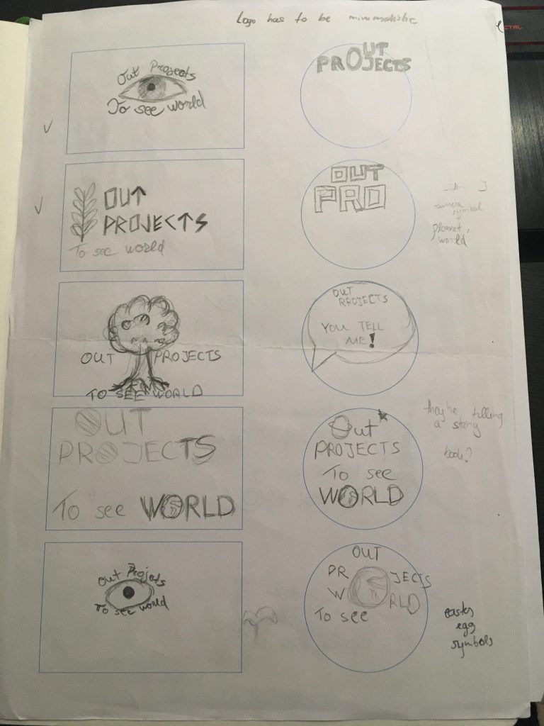
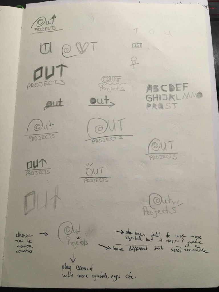
At first I had been struggling since I had no idea how to my make logo simple. There’s so many things that I would like my logo to capture, but to make good logo design it has to be easy to remember, which means it has to be something something simple and something that isn’t over done. Here’s some sketches when I had been trying to come up with the idea behind my logo:
Personally, when I sketched these I have noticed that in most of them there’s so much going on and it’s not very typographic. This is was one of the main problems I have encountered in the very beginning of my logo development. Either way from all these logos I had to pick 2 logo ideas from next lecture that I would like to work with:
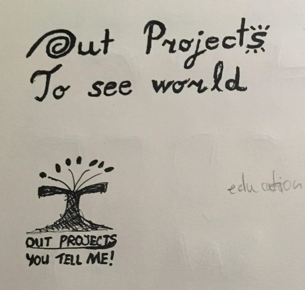
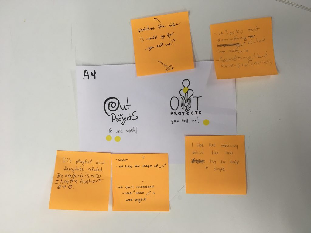
The main problem with the second was that it’s way too much overcrowded. There’s so many things in there going on. I have remembered that in the lecture it’s been told to use that logo itself doesn’t represent the brand and that the symbol only helps to perceive what brand might be about and this is the main reason why taglines and and advertising campaigns exist. This is one of the reasons why I have decided not too choose second logo proposal and pick the first one apart from it not being exactly typographic.
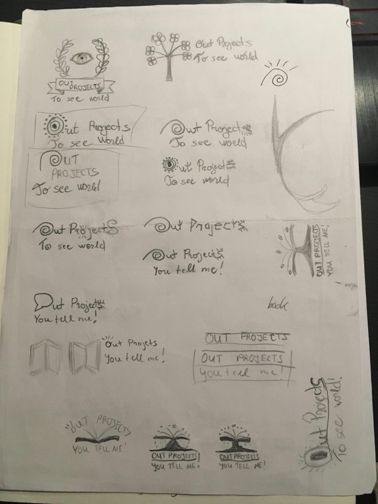
I had been given a lot of questions to analyse my current logo proposal and how I could improve it. Basically, this first logo is drawn using an element of an Easter egg when it comes to spiral, which is already a folklore itself. Apart from it this symbol also symbolises diversity, which appears pretty legible when it comes to folklore stories, as they have a diversity of monsters, creatures etc. Also, these stories are from different countries, so again diversity seems to be working quite well. I have figured this logo also is using Gestalt principle which is similarity, because spiral reminds of “O”. Though I wasn’t sure that the priority of text is right, since all of it is more or less in similar size, but this is something I had improved later on. Here’s some more sketches to test out ideas I had:
Later we needed to vote for our team logos and pick best 2 and after me and my team had been given a feedback on both of our logo proposals:
This is our first logo design that we have done as a team later on:
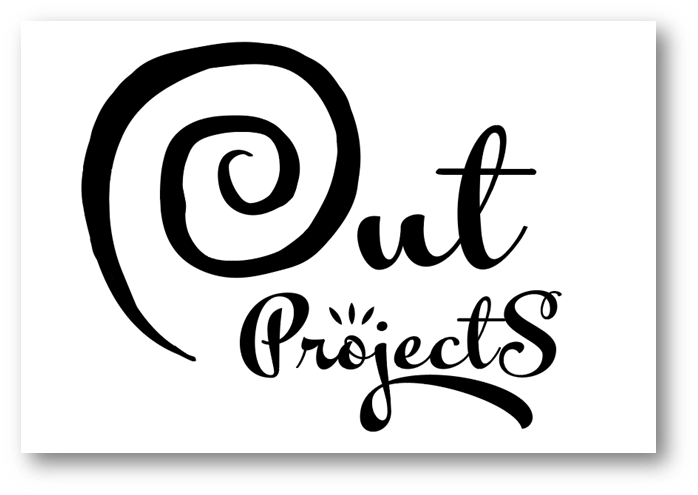
To be honest, I really liked the typeface, but I came to conclusion that the kerning could be some much better in this logo. We have also been given feedback that the spiral should be more elegant like our typeface, because right now it looks childish. Me and my team have been working on fixing our logo after such feedback has been given and this is what we have done:
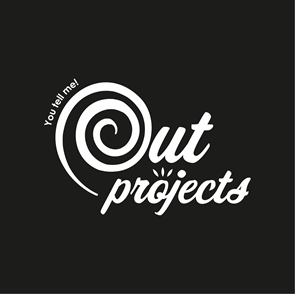
In conclusion, there was so many steps taken to finish up our logo design to make it look simple, clean and relatable to our brand. It took a lot of refining and team work to come up with this end result. Personally, I have enjoyed creating logo and I would like to do some more in the future.
