I had been given a task for my advertisement campaign to design the leaflet. It had to use the same visual language as I have used on my poster, but it had to be expanded. As a leaflet’s purpose is to inform, I also needed to write all the text, which I have found very fun to do. So here’s the things that I had to consider while doing my leaflet design.
Firstly, as I have decided not to use any particular typeface for my poster, I had to look for possible typefaces for the rest of my campaign. From the feedback that I had received about the poster (which I had already wrote about) I already knew it has to be sharp. So I went for Aktiv Grotesk typeface. It’s sans serif typeface, which is contemporary and matching the idea behind such exhibition while also being bold and working well with the concept. The choice to use yellow as the colour rather than a orange from my poster was basically because it reminds of the daisy which ended up as being an expanded concept. I couldn’t use yellow for my poster later, even though I have tried, it didn’t work. The example is below.
Since there was so much orange in the poster that I had chosen, I wanted to try to use orange as an accent colour which I have also been told to try out on one of the critiques. It seemed liked it was creating a lot of chaos with the design. Since I wasn’t sure though, I had spoke with the tutor and she had agreed with me on this.
Another things I had to consider how I was going to make the leaflet similar to the poster and how I was meant to expand the concept. Since I have used the only photography for my poster, I decided not use much of the illustrations. Though I have been told that it would be nice to see how I could show sharpness of the broken glass throughout the design without using only photography. I have been testing a lot of different shapes (for instance as seen above), but most of these were not working really well with photographically produced imagery. The only shapes that seemed to be working quite well was the ones that was abstract.
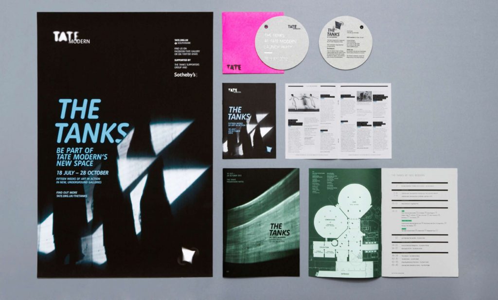
I had also decided to use actual daisies in my leaflet too, because for my tote bag design I wanted to be able to use them too. As I have looked into other advertisement campaigns like for example “The Tanks” that was taking place at Tate Modern, I have noticed that not all of campaign elements has the exact same visual language. It looked more like it has been added more and more within the each design, so that’s the reason why I wanted to use daisies for my tote bag. So to be able to use them for my tote bag, I had actually needed to start introducing them within the leaflet. Please see above and below for daisies on my leaflet.
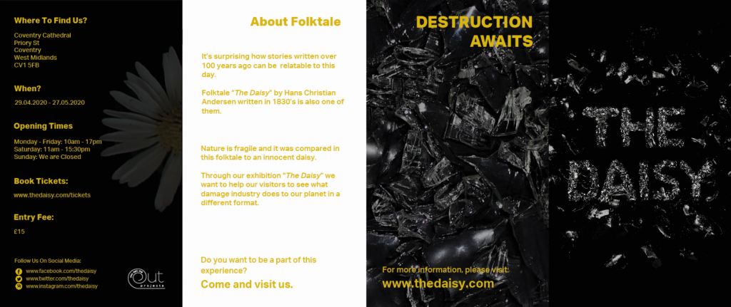
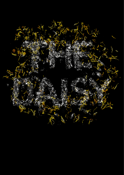
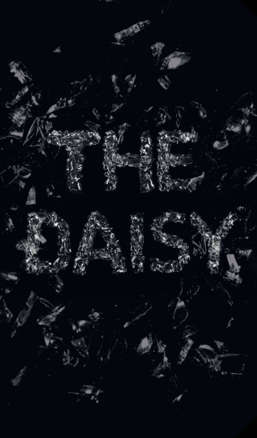
The only thing I had also wanted to improve was the front cover. What I had before was literally the text made from glass, but since I had worked on developing my poster design a lot, I had been missing the feeling of something loose on my leaflet like the poster had. So I had decided to use the shattered glass around the tittle of exhibition I had for my front cover.
In conclusion there was so many things that has been considered when making leaflet design. It wasn’t about only to make a leaflet design, it was also meant to match the whole exhibition advertisement campaign hence it had to maintain the same style, but it also had to be expanded.