During the first semester I had to make an editorial project and this is how I have found out about her. There was definitely no doubt that from 4 possible practitioners I would pick her. I always loved artwork that is bold, has a deep meaning behind it hence why I have decided to speak about Barbara Kruger on here.
When I first looked at her work what I was able to see was her personality. I loved her boldness and bravery. Me being someone who decided to express myself through my style since early days, I have never struggled to be brave. The other reason I have liked her artwork is because she’s using photography. I love photography and I have wrote here already about it in some of my posts. Also, Barbara Kruger is know for using the same colours on most of her work which is black & white picture with text in red background and she is also known for using Futura Oblique typeface. When it comes to using something familiar on my work I can relate to this on so many levels, because personally when I blog about fashion, all of my pictures are edited the same way, using the same colour settings etc. I believe it is something that makes artwork to standout and it’s way easier to get recognised if someone already knows some of your work.
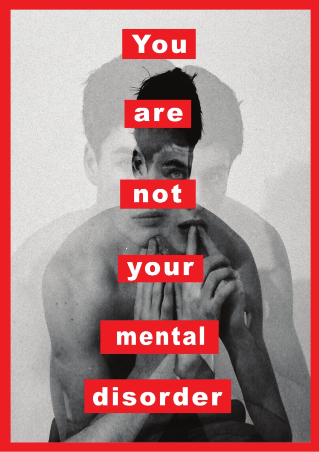
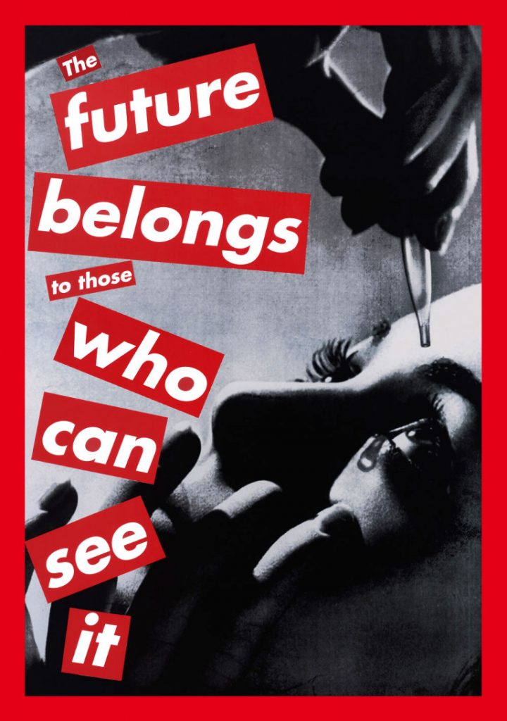
Apart from the things I’ve mentioned about her work, the other thing I would like to point out is the quotes she’s using. There’s quite a few of them that I can relate to, but the thing is Barbara Kruger appears to be very smart. When I was analysing her work and researching about her, she seems to be using quotes that are quite easy to relate more or less to everyone, since they are quite abstract, but it is something that I respect her for. I believe it’s not easy to come up with something that not only sounds bold and strong, but also that is relatable to others. For instance I agree with the quote “The future belongs to those who can see it.” To be honest it looks like this piece of her work goes really well here since the main purpose of this PDP is to make me see my future and what I would like to become, so basically this is why I decided to use this piece of her work on this post rather than any other.
There’s a lot of things I like about Barbara Kruger’s work like the boldness, use of photography, strong and brave quotes, but not only that, there’s also composition. I have just realised when writing this that even though I didn’t understood it before, these kind of compositions had influence on the work that I was producing. For example even my leaflet design.
Basically, Barbara Kruger is one of my favourite artists right now and I believe it will stay this way for a long time. Basically with this post I have already noticed some patterns that I really like photography in work, so this is something I will start to consider more in the future work that I will be producing.
EDIT:
I may have not realised it before, but I came to realise it now that Barbara’s work is made by doing collages and as I already spoke about it in the previous post collaging, I can already see a pattern here.