During the first term I was required to choose a typographer for an essay project that I have been doing. I have looked into a few, but I’ve wanted someone who hasn’t done many typefaces in general as I’ve thought it would challenge me more. So this way I came across Christopher Wool.
At first I have looked into his work and I thought that it’s rebellious to place the same word in 2 lines and sometimes in even more. That’s probably one of the reasons that I have picked him as the practitioner for my project. The other reason was probably the boldness of his words, which later turned out to be not necessarily his. I would like to talk about how I saw his work and how I’ve analysed it in this post.
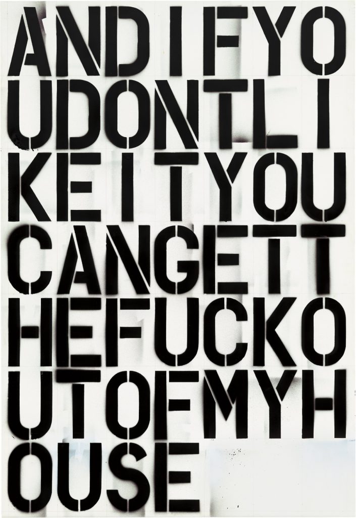
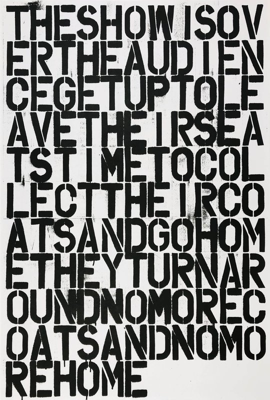
So basically what I’ve noticed when I looked into a lot of his work is that Christopher Wool’s work appears loud, because he’s using only upper case letters which also take the most space on his drawings. This and also “mistakes” in the words is what makes his work not only abstract, but also it makes it stand out, so the viewer/reader to look for a longer time. In some of his work uses smudges and drips of paint that makes the piece of work come together somehow. This is the type of messiness that has been done intentionally and it has it’s purpose behind it.
Edit:
When I looked into his work, what I’ve thought is that he could have used bigger leading, because in some cases it becomes too difficult to read, especially if there’s a huge amount of text provided (refer to an image below.) In my opinion this looks way too overwhelming and I believe the larger leading would have made it slightly better, but from the feedback I have received when my work has been graded, it was said that his leading is fine. But then again, his work is mostly artwork rather than actual production of typefaces, so rules could be way different compared to what I know.
In conclusion, I thought there’s some things that could have been done differently in his work from the technical side, but when it comes to practical, this is a piece of artwork rather than actual typeface, so rules can be different.