As any other blog as seen on the internet, all of them has different themes, layouts, accents colours etc. Even though I had chosen the “Modern” theme for my blog, there was quite a few things I have improved. In general I didn’t wanted to pick a theme where I just would upload the header image and call it a day. So here’s what I have improved.
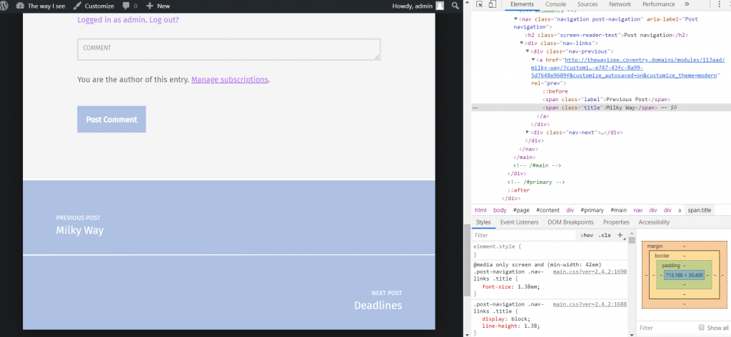
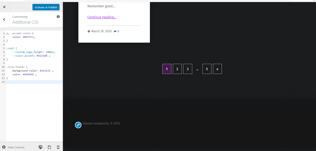
The very first thing that I have improved was to change was accent colour. Even though this blog had an option to change it altogether, I decided to spice things up a bit. The reason to this is basically because this theme is dark and I wanted to use more just than colour. So what I basically did was looking through the current code of the theme, so I could figure out what I need to correct. As I have been learning how to create websites for Design Practice module, this definitely came in handy. At first I have only changed the colour of the “continue reading.” I really liked this colour, as I felt like this gave some personality to my blog, especially since I love purple. I wanted my blog to feel more like it has my personality to it.
The other thing I have wanted to change was the colour of the buttons. Once again I had to look where this colour code is by inspecting the theme. I had even tried quite a few colour codes. But I have decided later to stick with dark purple, since it would make more sense as it’s accent colour and I didn’t wanted it to look tacky.
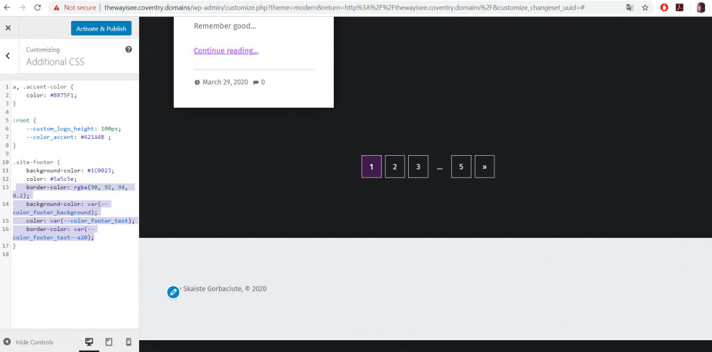
The other thing I wanted to customise was the footer. I felt like it also needed more personality as the previous one didn’t worked that well with my chosen colours. I even wanted to add an audio player to my footer with some lo-fi music, since the blog was already reminding a lot of Tumblr. But this audio player ended up expanding the size of the footer, so it didn’t really work well, so I decided to get rid of it.
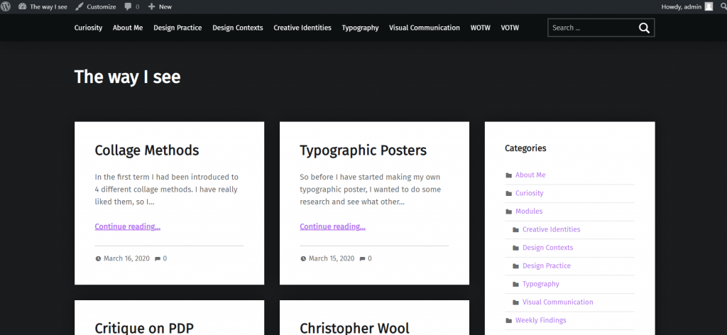
There was also quite a few issues within the theme itself that I have thought doesn’t match the whole concept of the blog. I felt like need to include categories somewhere, but once I have included them on the right side of the blog, the grid itself had only 2 columns instead of 3. This definitely affected the whole look of the blog, but not in the good way.
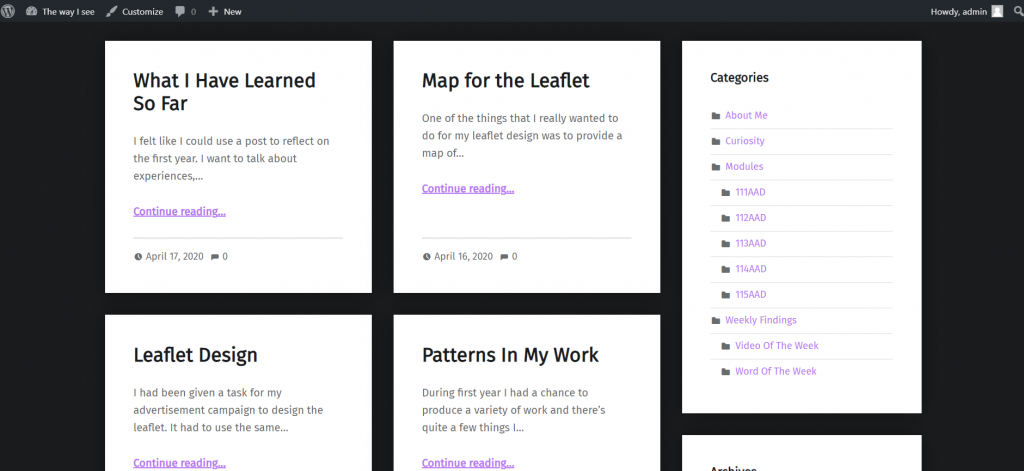
That was until I had played around with the menu bar settings and added categories to there. In this case the viewers of my blog would be able to see the categories straight away without it clashing with the content. So later I had deleted the categories from the right side.

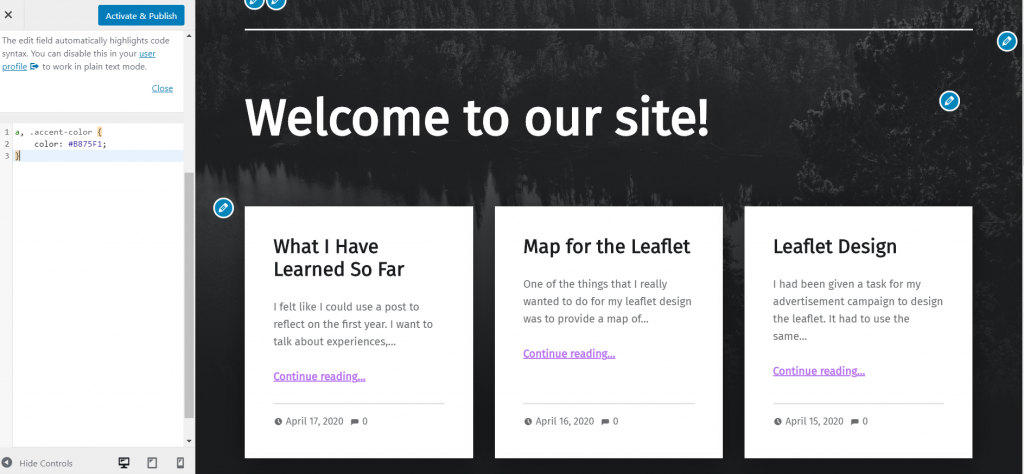
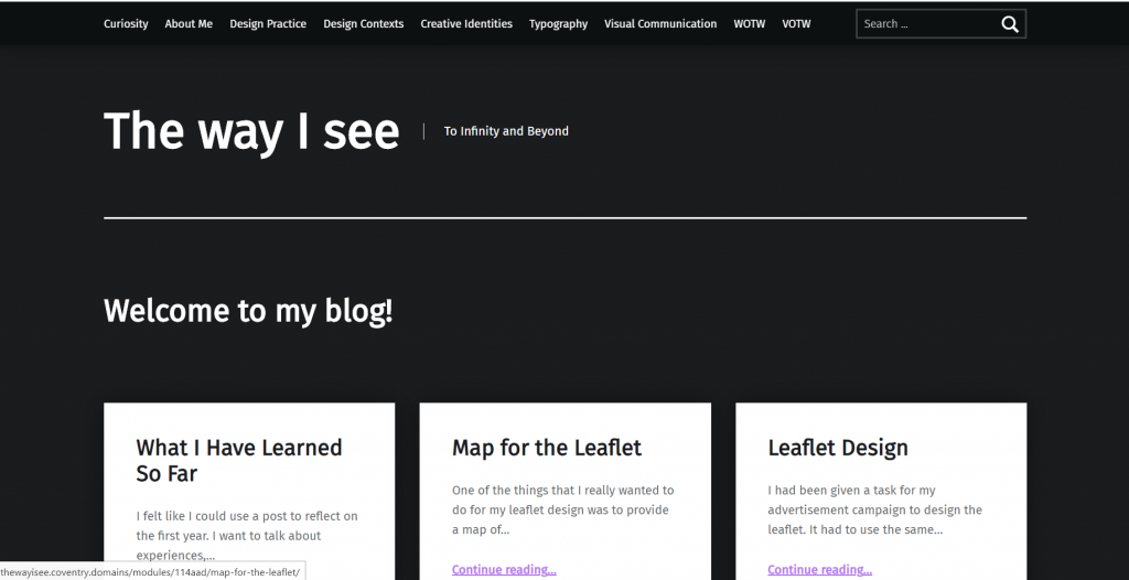
The last thing I have been improving was typography. I didn’t wanted to change the typeface though, but I have definitely felt that the “welcome to my blog!” part was way too big and the name of my website was definitely too small. It just didn’t looked as they’re prioritised correctly.
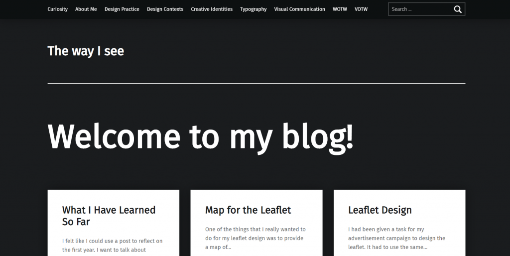
Basically, at first I wanted to get rid of that welcome to my blog in general, but then it felt too empty. Luckily I was able to find which parts of the code I need to change when adding additional CSS, so I was able to fix it.
As of right now I feel like my blog has that Tumblr vibe since I have used a lot of dark colours. But not only that, I feel like it also just shows that I prefer dark themes in general as I have already wrote about in my blog post about iPhone dark mode.
In conclusion, I’m really happy how my blog has turned. I was more than happy to apply the knowledge I have learned in coding to incorporate my blog style even more as well as give it some personality.