In the first semester I had been given a task to create my own typeface from the drawing that I did it class. I have never made a typeface before, so there’s a lot of issues I have encountered with as well as I have been able to learn from.
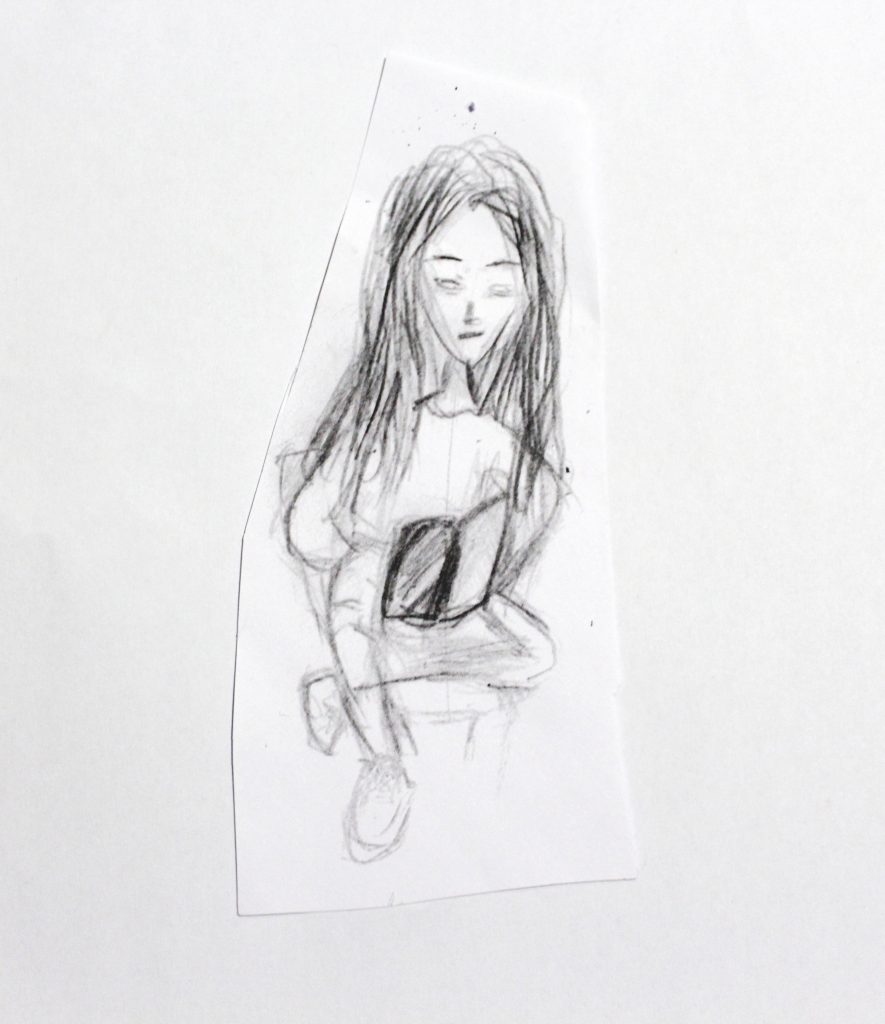
Firstly, I had to identify qualities of my drawing. My drawing was sketchy, harder at the top, messy, in the bottom there was mostly contour of the things and the drawing there wasn’t filled in. These where the main qualities of my drawing, so I had to apply all of these in my typeface.
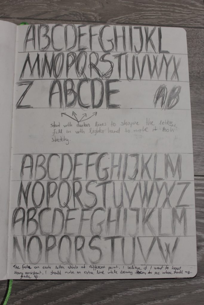
With my first tries I had been trying to capture the messiness of my drawing with my typeface. Also I had been trying to make it look as it has a fade, so it’s heavier on the top.
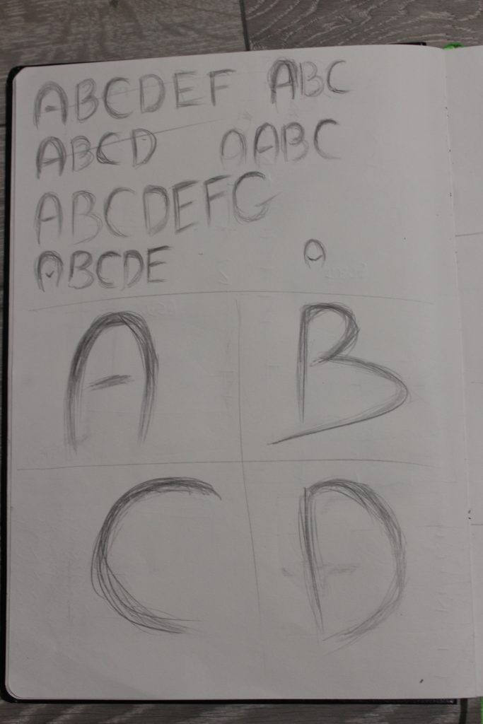
Then I have decided that these letters should be using some guide lines to make them more consistent as well as more legible. But after trying it I have decided that even though it’s messy, it doesn’t follow the guidelines that well and it needs more of them.
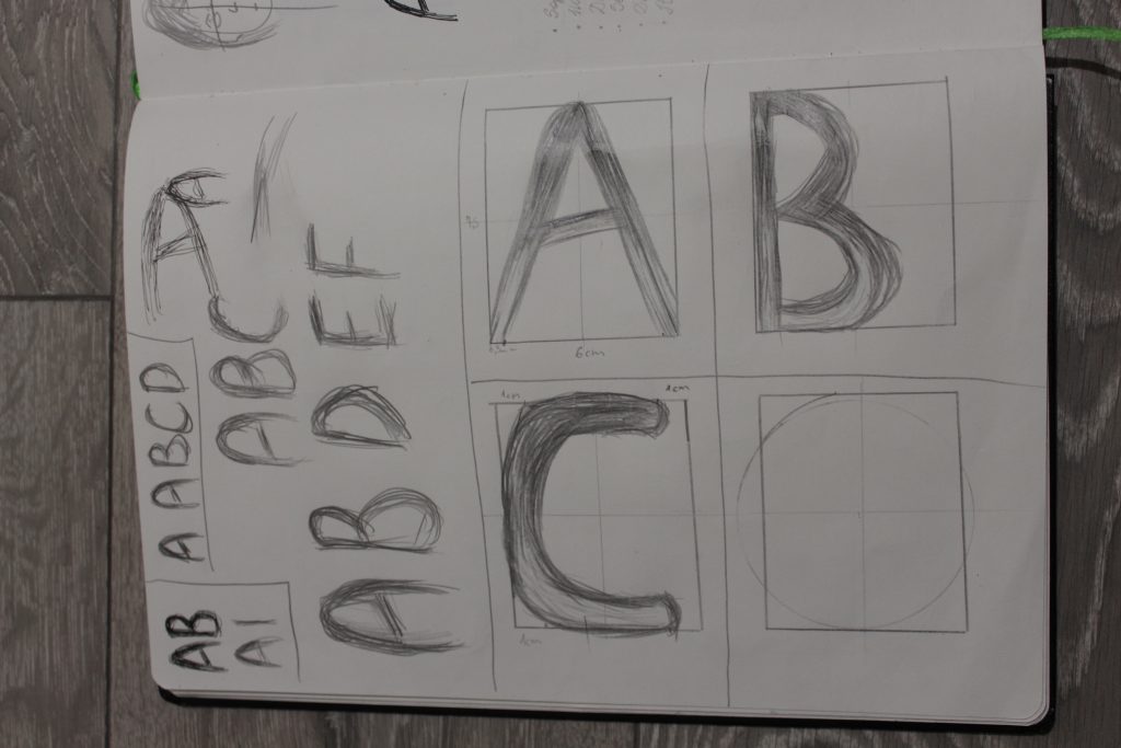
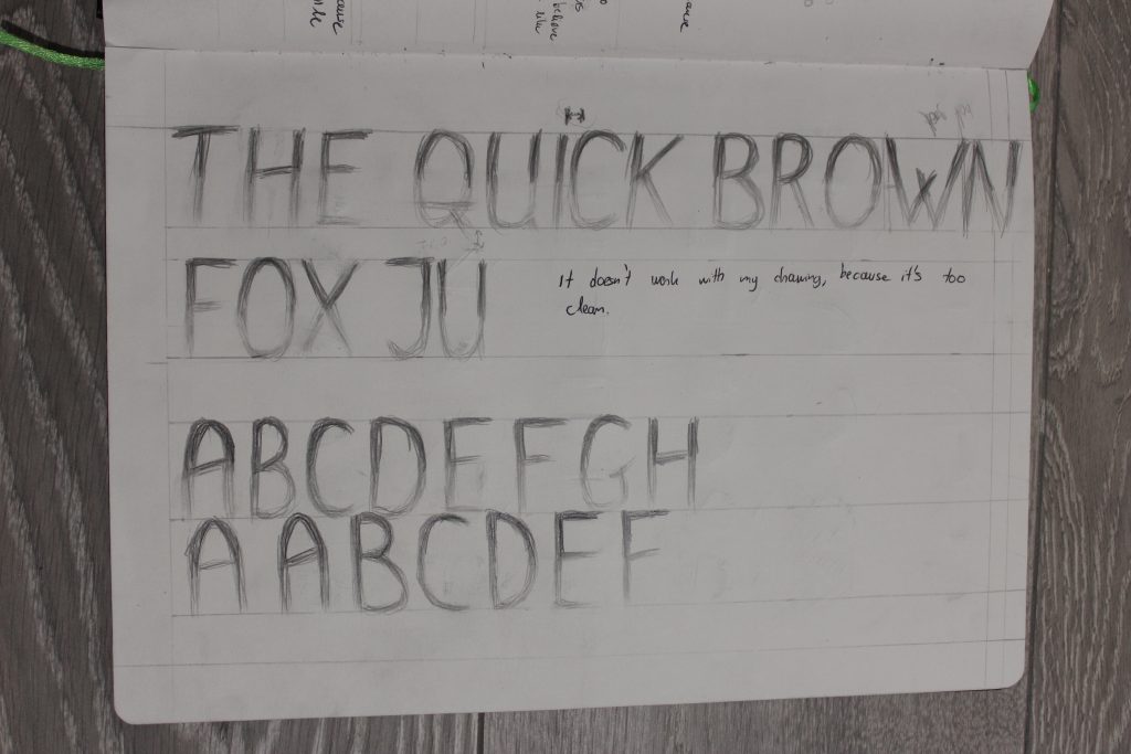
Then I decided to make my letters with a different tool which in my case was marker, because I wanted more precision with the messiness that I was creating, but I ended up having letters that are too clean and thick. I was also using more guidelines for these letters here, but I ended up discarding the use of marker as well as detailed guidelines for my typeface, since I have been told in one of the sessions that I should use the tool that my drawing was made with. I have also been told that I don’t have to use guidelines if my drawing is messy by itself, which makes sense, since my drawing doesn’t follow any guidelines and my typeface shouldn’t as it won’t capture qualities of my drawing that well. The reason why I have started with H and O, because I had red that it’s best letters to start with as it gives a basis on how other letters should be drawn.
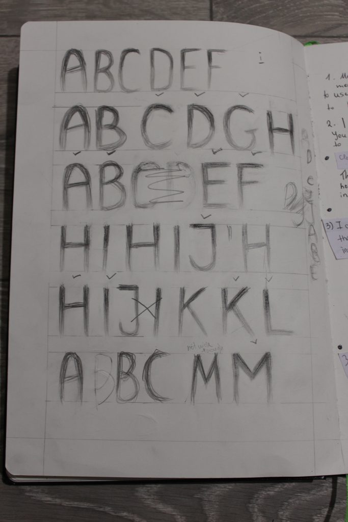
Later I decided to work again with the very first idea I had, but to make my letters more refined, because that’s what I was also doing with my drawing after I created messiness. But after trying to do it few times I have felt like it’s hard to make my letters facing the same direction, what I mean by this is the angle of them, some are more straight than others and also some were wider, so I decided to use a few guidelines again, but to try to maintain the same style.
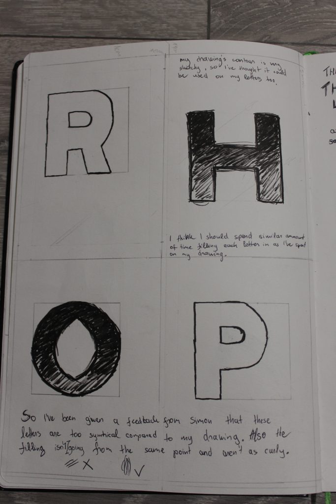
I have decided to use guidelines for top and bottom, but also for wideness. Another thing I did I decided to erase bottom of my letters to create fade effect too. I really liked how it looks, but it wasn’t very similar to my drawing.
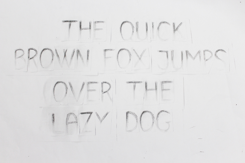
Sometime later I have asked for feedback, because I didn’t knew what else I could do, but what I’ve been told is that I could use a couple of guidelines so I can work with the height, but other than that after using it I should make it more messy in the end. So that’s basically what I did as it made sense. These letters had seemed to work the best from all of the ones I had and I felt like I have tried everything already, so I decided to make my pangram for them.
When I made my pangram, I have realised that there’s a a lot of issues that appeared after scanning letters and cutting them out. Since my letters where messy, I couldn’t them out properly, so I had to cut them into rectangles which haven’t ended looking well. In my opinion, the bottom side was quite lost to due to scanning.
In conclusion, there’s a lot of things I had to consider when I was making my typeface from the qualities my drawing had. There was a lot of issues I had encountered with, yet still I ended up not liking how it turned out. I have made a new pangram later on as I have recreated this typeface, but this is for next time.