One of the things that I really wanted to do for my leaflet design was to provide a map of the exhibition with the insight of what will be shown there. As I had been told during lectures the leaflet has higher chances to be taken when it has some benefit for the user. This is just one of the things I had considered when making a map for my leaflet, so I have decided to write a post about it since there’s more.
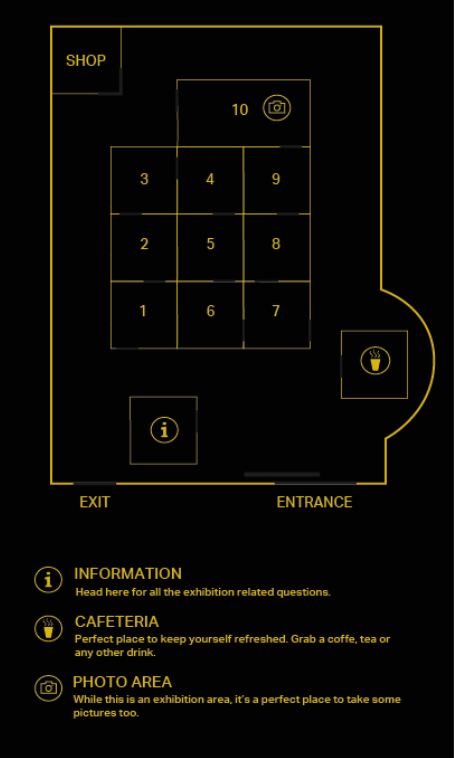
The very first thing I had to do was to research how other exhibition maps look like as I wanted to know what I was dealing with. All of them seemed to be really simplistic, with a legend, numbered rooms or the names of it placed where it’s drawn. I have also noticed that icons are used as well as the entrances, exits and pathways. When looking at these I had came to conclusion that for such events like exhibitions it’s important not to waste time on trying to understand map that is complex.
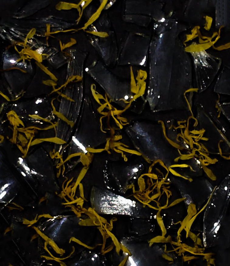
I have decided to make my map pretty simple too as I been looking into research that I’ve made. But the first question I had to answer was how many rooms I will actually use. Since I have wanted to make some sense with my exhibition and actually to showcase more, I decided to use the total of 10 rooms for exhibiting work, but I also decided to consider the use of space that I had. I have came to conclusion that I should also use a cafeteria, so the visitors could have a refreshment. I also wanted to add an info centre, so this way they could ask info about exhibition and also about OUT Projects in general. The other thing I have decided to include at the end of the exhibition was the shop. Since I also needed to produce the tote bag, I wanted to make a space for visitors to buy it. I also wanted to include the option to take photos, but only in the last room of the exhibition. The reason to this is simple. I have chosen to do this because the last room of the exhibition is the room that is also the inspiration for the tote bag design. I want my visitors to be able to remember it. This is how I would imagine the last room of the exhibition:
Since most of the maps that I have found has a pathway of the plan how the exhibition should be walked through, I have also decided to use this to make more sense. For example the last room of the exhibition will lead to the shop and it’s done on purpose, because the chances to sell tote bag is way higher just after the visitor has seen the exhibition. The factor of excitement as well as the memorabilia to make more memories actually made sense when placing the shop there. Same as the info centre is in the beginning or the cafeteria is about in the middle of the exhibition for the refreshment. Basically I was planning ahead and I had tried to think as a visitor myself.
When it came to drawing the actual map, I would say the project where I had to draw a map for Spon Spun festival actually came in handy. I already had more knowledge how to use the pen tool which definitely was something that made it easier.
To conclude this I wanted to say that there was a lot of things that has been considered when making a map for exhibition like the practical side, visitor experience, the gain for the exhibition to sell more tote bags as well as the theory of how the exhibition maps look like. I’m pretty happy with the outcome of the map that I have produced and I believe all the content makes sense. It had also helped me to visualise the exhibition more and take what has been asked with the brief beyond expectations.