Nycxparys is the brand that sells edgy clothing. As the clothing is edgy, they have also seem to wanted to capture it with their website which I would like to talk about within this post.
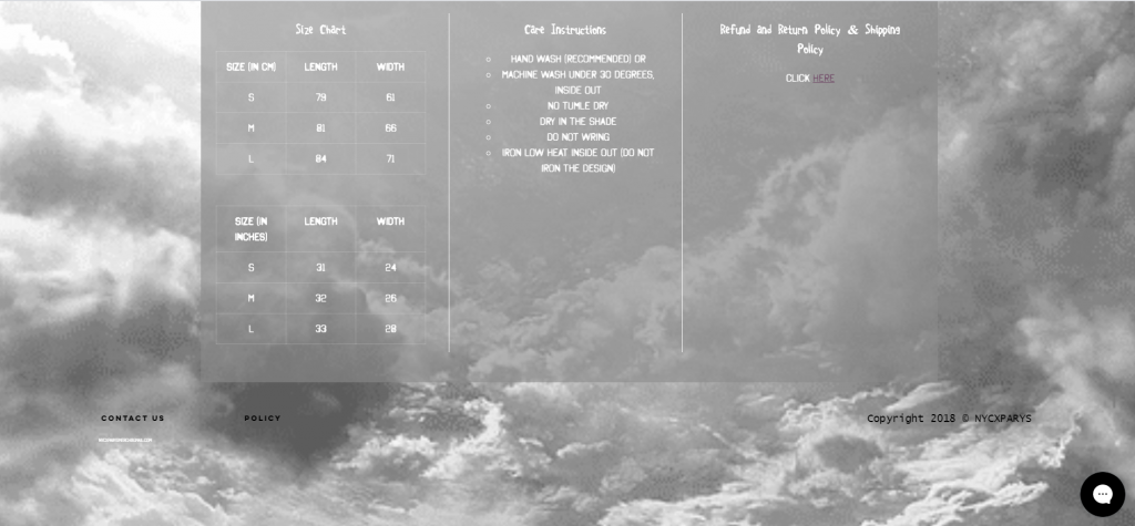
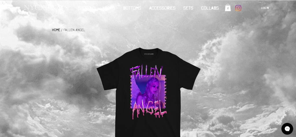
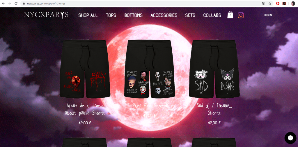
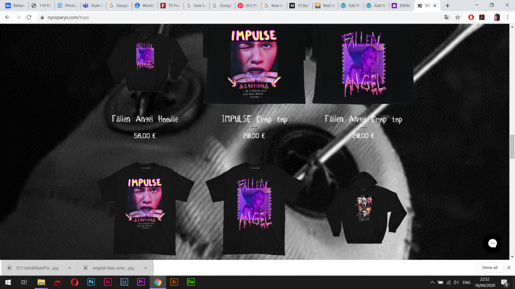
Firstly, they’re using the gifs for their background, which isn’t ideal when it comes to viewing the information like product names, descriptions and photos of the products. Even though the gifs itself seem to catch the feeling of the items they’re selling and the general style, these gifs not only hide information in some cases as the colours aren’t selected carefully, but also it takes way too much attention away from the products etc.
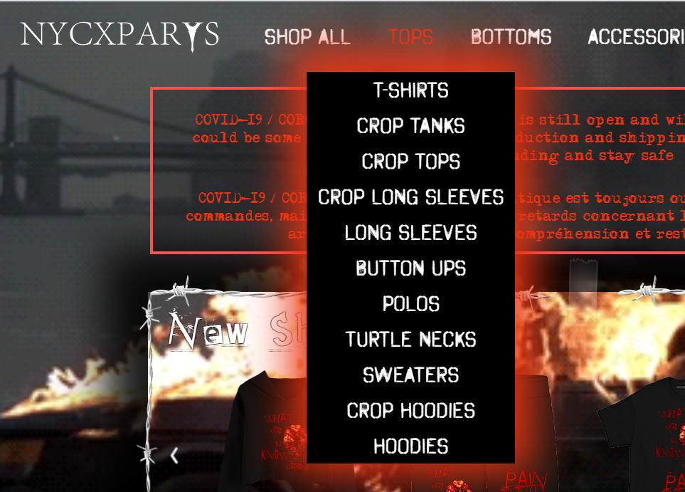
Another thing that I would like to talk about is typography. I feel like for any kind of website the typography should be simple, especially if the website has other things that takes so much attention like in this one. In general, from what I understood when I was learning about websites in lectures, it seems like the content should be the only thing that captures the most attention, not the typeface, not the background. That’s why I’d say this choice of typography doesn’t really work.
The other thing that is worth mentioning about this website is that the footer seems to be lost. When looking at the main/home page it is clear that the information placed in the footer only appears when the background doesn’t hide the information, meaning the visitor has to look for the footer to be able to find it and find a way where the gif doesn’t hide it as the colours are the same.

From what I have already talked about, I can definitely say that the users experience hasn’t been considered when it comes to such website. As a matter of fact the website creators only cared about incorporating the style of the clothing they’re producing. The only option that it seems considered more is when it comes to viewing the product information as the sizing is placed in the table, but still the gif itself takes all the attention way. Plus the menu bar is completely lost when viewing information about products.