So before I have started making my own typographic poster, I wanted to do some research and see what other typographic posters I could find on the internet. I took this research to see how the typeface could actually incorporate the concept behind it. There was quite a few posters that I’ve liked, but I have also saw one that I wasn’t the biggest fan of.
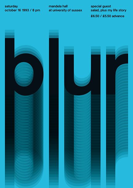
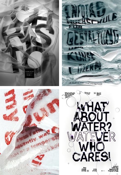
The first poster that catched my attention was “Blur.” What I liked about this poster is that the blur itself is capture very well. The whole idea to have different opacity seems to be working quite well and the blur itself visible, though I believe that even without word “blur” it would be quite evident what is it about.
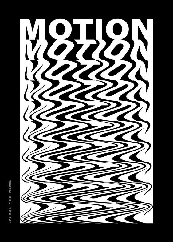
The second poster is “Motion.” What I liked the most about this poster is that the word is getting way more distorted at the end, but it all seems to be coming together pretty well which literally creates a motion when it’s all placed together this way.
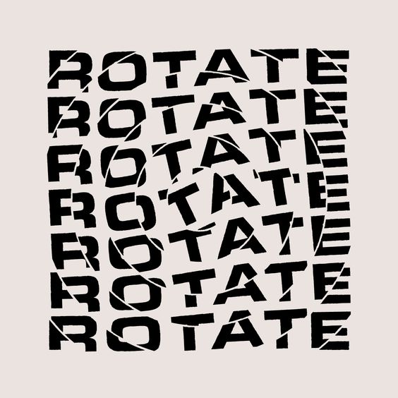
Another one would be about “Rotation.” Once again what I liked about this is that it captures the concept pretty well. It looks that it rotates and the way it’s done really works. Also I like the fact that it’s kept pretty minimalistic.
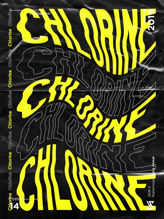
Once of my personal favourites was the “Chlorine.” It gives a feel of water and all of the distortions follows the water too. I also like the idea that this poster doesn’t seem so empty due to the continoues use of the same world. In my opinion this is what makes this poster so appealant to me.
There was quite a few more posters that I really liked, but here’s the ones that actually gave me the idea how much I could actually play around with the tools I have at home, which I already did and I wrote a blog post about it too.
https://www.pinterest.co.uk/pin/821273682036044907/
https://www.pinterest.co.uk/pin/821273682036044855/
https://www.pinterest.co.uk/pin/821273682036044834/
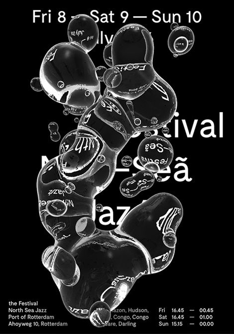
There was one poster though which I wasn’t the biggest fan of. This was made for North Sea Jazz 2016 festival, but even though there’s water, I don’t quite feel it’s right for jazz festival. I feel like some important information is covered with water and despite the fact that some of it is turned around in the water bubbles, I believe it’s too complex for the viewer to understand. Of course I like the idea behind it, but the way it’s done doesn’t work for me.