Prior to our meetings with the team I was researching the typefaces we could use for logo and whole campaign, I wanted to find something that appears tech but also has more rounded qualities when it comes to typeface as I was trying to ensure it appears more feminine. Here I also looked at different logos in tech and I have found that they are using a lot of gradient so it was one of the things that I thought would give a futuristic and techy feel. It felt like the whole culture surrounding tech related designs are commonly using it nowadays and it is recognisable there.
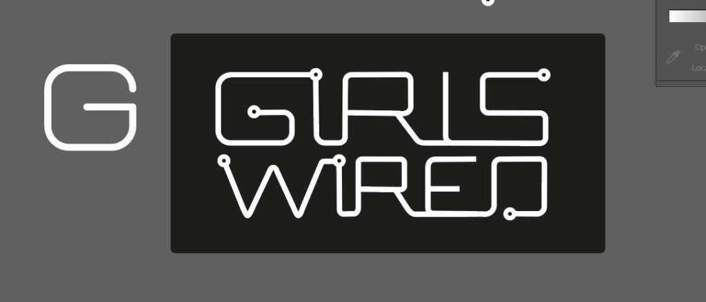
After finding all this info I have tried to create some logos and been trying quite a few things and shapes that I thought could be relatable. In most cases I have tried to use the typeface itself to add socket visuals etc since I thought it would appear more consistent with the whole typeface and would tie the logos together better.
At this very same week I also noticed that a lot of graphics related to tech are quite geometrical, so I decided to look for more complex geometric shapes that we could even use for our visual language.
One of things that we have tried to do after given the feedback from client was to clarify the message on our project. On this we all worked together as well and I used once again my popular purple sticky notes, since I wanted to ensure that it’s distinctive and it was easier for me to keep track on my contribution.
During this week I have also been looking a lot into background of the whole topic and it appeared that females lack of role models in tech jobs compared to other specialties. The other reasoning was that women are more likely to select roles that could help change the world or would leave some impact. It was interesting findings for sure, so here I wanted to ensure that our campaign can offer some of it and I suggested to the team. They all seemed to like this idea and so did the client. This is where including role models and women support that are already in the field came into place.
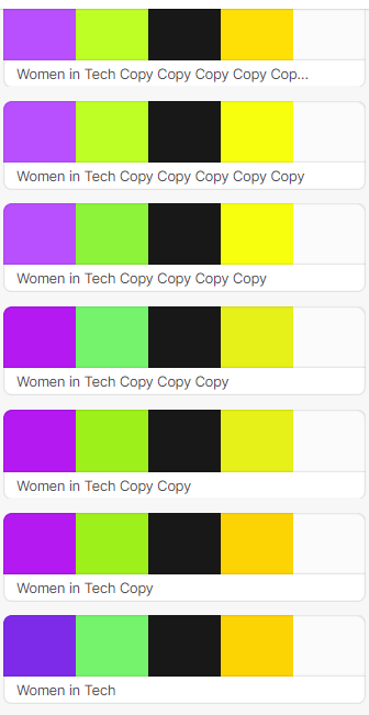
This week I also been looking into colours palettes and colour meanings, but also been making some of the colour palettes for the team that we could use. A lot of them weren’t working that well since the colours we picked were all quite different, so it was a bit hard to match the shades without making them look dull or too dark.
I also looked into stock images for our project. We all have discussed with the client that we don’t want to use cheesy imagery, so I already knew what to look for.
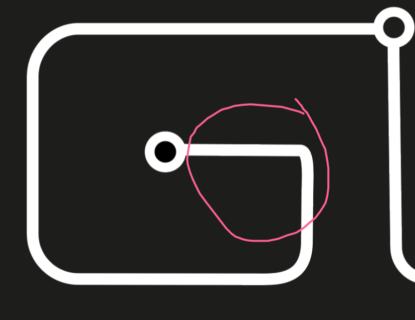
There was one thing that I addressed as an issue on our logo, it was G letter than seemed quite different compared to original typeface. So I decided to fix this issue as it felt rather odd on the logo as well. My team agreed with this as well.