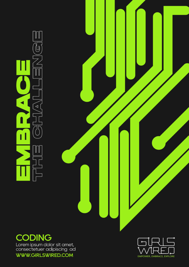
From week 3 to week 4 I was working on developing some of the ideas for the posters including the visual research I have done for it. I still had ideas to try something retro even or even liquidy. I have been playing around quite a lot with posters and see all possible placements etc. I know that practice makes perfect, so I have tried to spend quite a lot of time on this and see how few ideas could be developed differently.
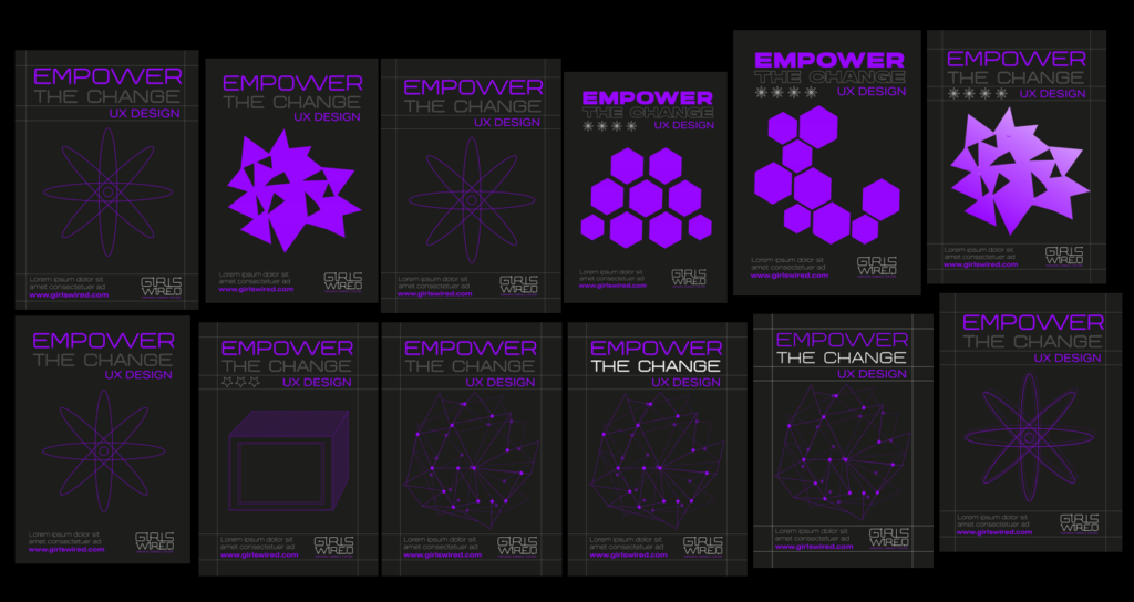
I offered to my team on WhatsApp that we could do something a bit more fun and showed my findings, but here it seemed that my team preferred to do something less experimental due to time limit we have. Since it’s a team project and majority agreed on that, I had to do it as majority decided. Teamwork is one of the most important things and while sharing ideas is always good, it might not always be the best solution for the team. I think it’s one of the things when it comes to the work in industry after I finish university that in some cases I won’t have enough time to implement some of the ideas and it’s completely fine as long as I do my best to keep up with the requirements and standards of industry.
Since we were given feedback to incorporate the gradient to our logo, I have tried to play around with that as well and see what works the best regarding this. We have also been given feedback from the client to mix mine and Velislava’s poster ideas, which was my typeface choice only and her design, but it still felt nice to include something from my development since it felt like my work on the posters I have tried making wasn’t for nothing. Client also liked my typographic poster idea and agreed that we could use it.
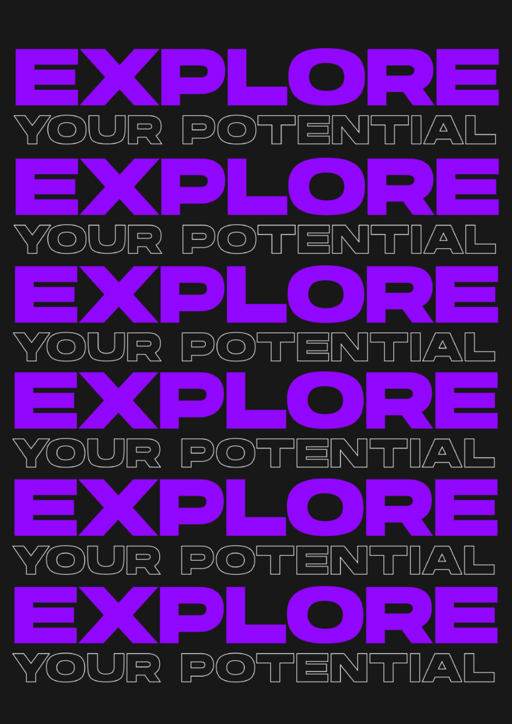
After such feedback, I have tried to work with posters. I have seen Emily has done some, but I have found typeface for title too big and the typographic poster idea that I had had a few inconsistencies when it came to typesetting. Here I have tried to make the poster on InDesign to try approach it the way it would be in industry. The image was in this case edited in Photoshop, while the circuit illustration was taken from Illustrator and the text elements where done in InDesign. I have also used grid here, but my team seemed to like the design I have done in illustrator and photoshop only more. I also had to make some minor adjustments on circuit shapes since it was affecting the placement of other elements and taking up negative space. I also been typesetting the titles and in some cases where the letters which I was kerning were the same, I was applying the same amount of kerning. I wanted to make it as consistent as possible. I did try quite a few images too since some of them had some issues with the shape we had as it was affecting how image look despite where I would move it within a clipping mask and some images where way too dark and blended too much with posters.

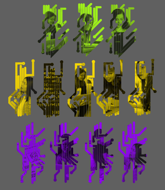
Here I had idea for the third poster to make it a series and have 3 posters for each colour, but we later decided with the team it we already have enough. And since one of our ideas was to put both of the posters next to each other on educational magazine, we ruled this idea out.

