On this week I was mostly focusing on looking a bit more into educational campaigns and what elements should be considered and included there. I wanted to ensure that the things we have came up with are appropriate and also see if there is anything else that would be crucial to include. It seemed from my gathered findings that can be seen on Trello https://trello.com/b/g9qDgn1j/women-in-tech that we were on the right track and that our ideas we had was quite a logical solution to the brief we have.
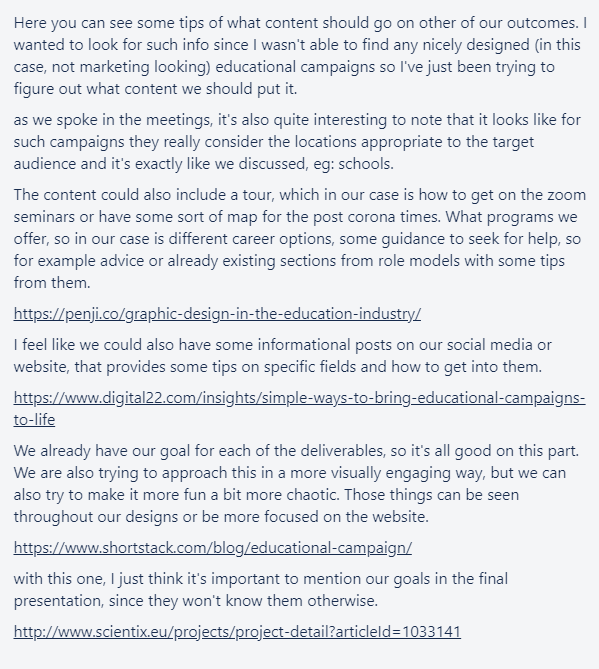
Here I was also looking into different educational websites, especially STEM related, since I wanted to see what else I could find and how companies and campaigns present themselves. In most cases the websites I came across seemed really text heavy, but I didn’t wanted to do that since the target audience is 16-24 year olds, the main idea is to keep them engaged with some flashy and bold graphics and for them to be able to digest information easier. Most of the landing pages have been saying something related to the whole content of the website and what could be find there while having calls to action on these things. It always included something about the brand like their mission or what people could do there with the help of this website which provides value to visitors and makes them stay. I would think it’s a good strategy when it comes to including such things on the website.
I also tried to see what goes into footer design and what I should mention to make it more reliable like career support etc. I also looked at different footer designs, but I decided it’s best to use the simple design since it’s an educational campaign and my team members agreed with that. I’ve looked at different websites to see how their hero image section looks with composition since I wanted to try something different and challenge myself. I also looked for some navigation bars as I wanted to make it more interesting, but there was a lot of things that wasn’t going on campaign and I haven’t wanted to make it overcrowded as well.
It appears that there is a difference between landing page and home page. With landing page there should be minimum links included if they aren’t leading to something that the visitor came from. So here I decided that I should add links on mission statements and role models section on landing page as a result of that. I felt like theory is quite important when it comes to the website design, so I wanted to ensure that I should know what I’m dealing with especially since I never had to design landing page and I wanted my design decisions to be as informed as possible.
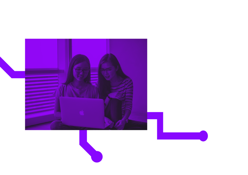
At first point I’ve started designing and trying to see what could work. Since I have found some inspiration on hero section on websites, I wanted to try something less rigid than just adding image especially since we have those circuits shapes. It didn’t seem to work though for most part, the circuits were way too big and if they were smaller they would have affected the masked image into that shaped while using only it without image felt try.
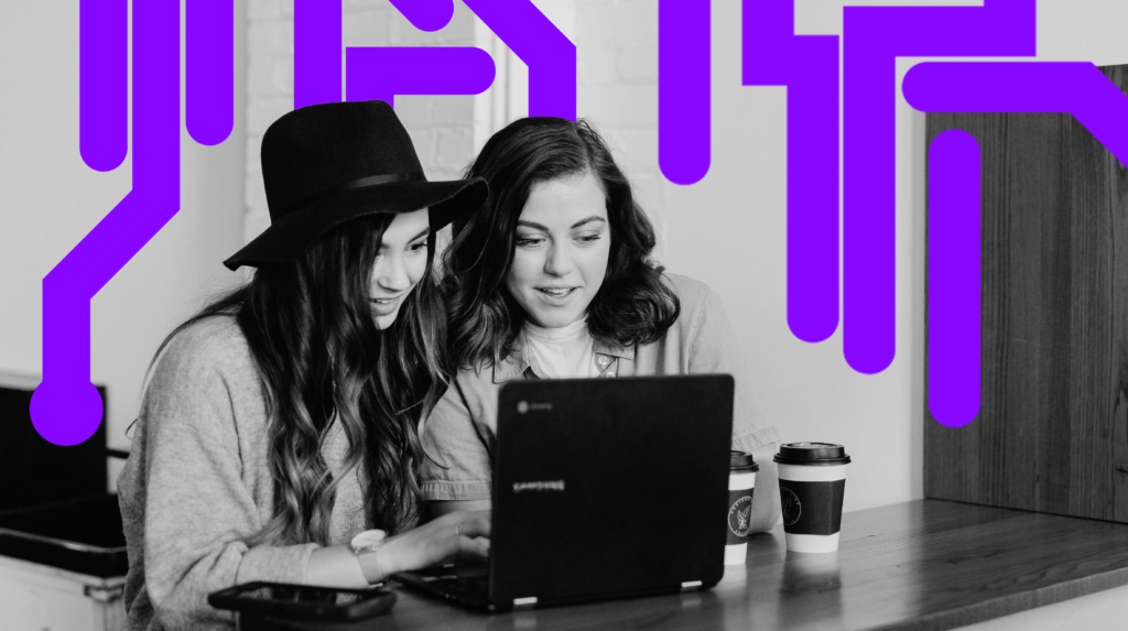
I liked one of the ideas that Emily had for the social media and it was adding circuit shapes to the picture. I wanted to add some consistency on the website and I have tried doing that. There was some struggles with the cut and I’ve tried to make it as clear as possible without any wobbly lines.