Since the Sam Neves talk that I have went to I started to wonder about Youtube thumbnails. What surprised me is that someone can actually hire for such thing. So I have decided to talk about it here. I must admit I never done a research about it, so it’s basically what I think from the previous experiences that I have encountered during my studies and the work I have produced as well as for the thumbnails I have created myself.
As a fashion blogger I already have my Youtube channel so I had to make some thumbnails already. So while it is still something new to me, I’m somehow already getting familiarised with the concept of it. As I have noticed the best thumbnails usually have something that is related to the video itself, for example if the video is about how to grow Instagram account, the thumbnail will definitely have Instagram logo. Usually no one bothers to read the tittle of the video if the thumbnail doesn’t catch the attention first. So what makes the viewer catch the attention?
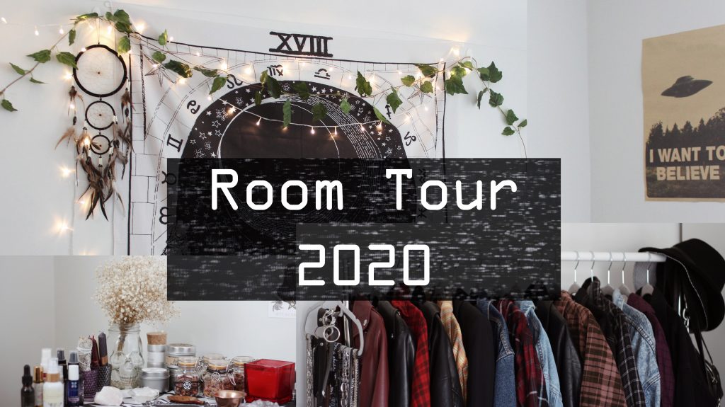
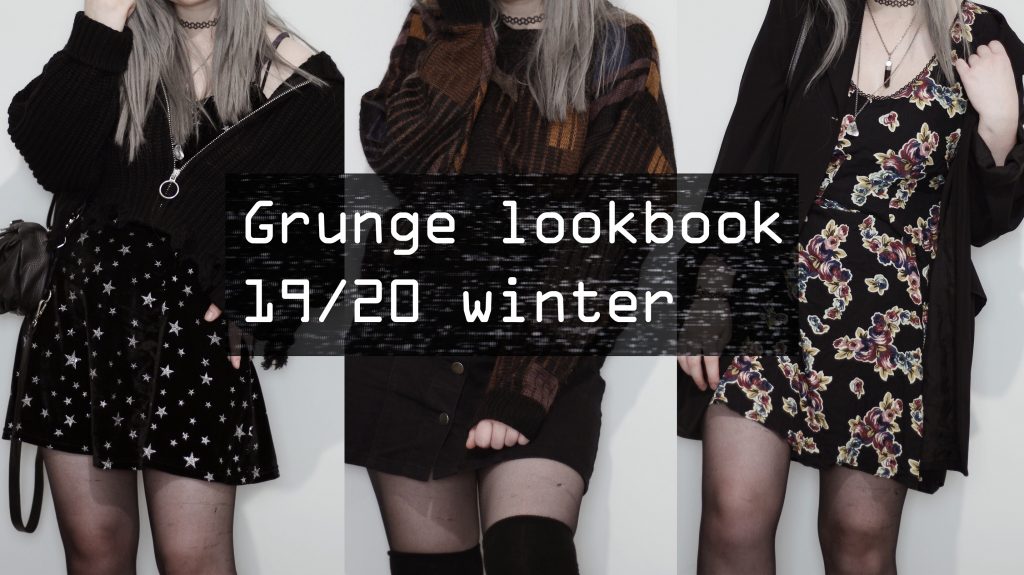
Firstly, I think it has be something that will make a viewer think “Oh, this video is definitely made by particular creator.” But the question is how to make it look like it has been done by that “particular” creator. Well, first things first is that the creator in my opinion should have his own colour palette, so it gets recognised easier. Though I’m sure it doesn’t have to be a colour palette in some cases, for example if the video is mostly visual. In this case I would use the same typeface, the same text placement on each of the thumbnails which is easier to recognise. In general, the same editing style might help the current subscribers to recognise the video of the particular creator. Here’s 2 examples of the thumbnails that I have made for my own videos:
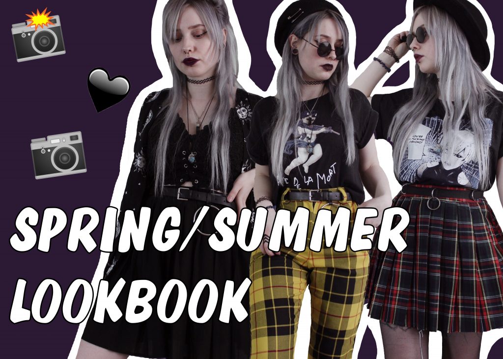
But when it comes to searching for a new content, I’m pretty sure it has to be eye catching. To be honest the videos that has a lot of views that aren’t exactly from very popular creators is the ones that has a background with a bright colour and some cut out fragments from the video, icons, logos, emojis etc. Or in general it can be something that pops out a lot. I think this is one of the main reasons some creators have this outline thing on their Youtube thumbnails. For example this thumbnail that I’ve made for Youtube was the very first one, but I have decided not to use it since I wanted my thumbnails to be similar to the content that I’m producing as I already have an audience on Instagram.
During my summer break I will make more time to produce more Youtube videos which means I will get more time to experiment with thumbnails as well as researching some of the things that should be considered when producing such work.
To conclude this, I think that having a personal editing style is a must, but it also has to pop out so it attracts a new audience too. Everyone likes a quality content and the thumbnail is a perfect way to reflect it.